Tuesday, February 8, 2011

Stitching Pixels: How It's Done pt. 2

Making the Pattern


Making a cross-stitch pattern out of your image is probably the most tedious, time consuming part of the process (other than the actual stitching, of course).  I've been using Adobe Illustrator to make my patterns, and that's what I'll be using in this how-to.  I realize not everyone has access to AI, so I won't go too far into program specific detail.  There are plenty of other (sometimes free) programs that will do basically the same things I'm doing here.


STEP ONE - Find the Borders


The first thing I do after opening the image is find the borders of the image itself (when opening the image, you might want to enlarge it so the lines you make later don't run together and make the pattern unreadable).  I use the line drawing tool to draw horizontal lines at the edges of the top and bottom-most pixels and vertical lines at the left and right-most pixels.  This will help find the exact center of the image itself without having to worry about whether or not you added an equal amount of space around the edges.  Adding a margin can be done much later in the sewing process.


When drawing my border lines, I like to make them a little thicker than I plan to make the actual grid and of a brighter, more visible color.  When this step is done, it'll look a little something like this:


STEP TWO - Find the Center


This step will probably vary depending on what image editing software you use.  In AI, it's pretty easy.  At worst, you'll just have to do some counting and simple math.


I start off by using the pencil tool to draw little carrot shapes ( > ) with the point on the top and bottom lines along the side of the image.  Then I draw one kind of floating in the middle between those two.  In AI, I can select all three carrots and use the align tool to distribute them evenly by the center of the shapes.  This will move the middle floating carrot to the exact center of the ones on the top and bottom, giving you the place to put your center line!  Repeat the same steps for the top, and you'll be ready to draw your center lines:
(click on the image for a better view)

If you don't have the ability to align your little arrows like I did in the program you're using, you might actually have to count the pixels from top to bottom/side to side and divide them by two the old fashioned way.  If you come up with an odd number and it doesn't divide evenly (or if your little carrot aligns itself in the center of a pixel instead of in between rows), just shift over or up to the nearest space.  In  big pattern like this one, half a pixel isn't that big of a deal, but in really small patterns you might keep it in mind.  But like I said, it's not that big a deal.


STEP THREE - Drawing More Lines

This is where the process can get a little tedious.  Using the line tool again, start making lines in one direction using the pixels themselves as a guide to start making the grid.  Make sure your lines are thin enough to not obscure the pixels too much, and use a color that contrasts with both the image and your center lines.  Once you get a few drawn, you can use the align tool to space them out evenly (if you're using Illustrator) and then copy and paste the group so you don't have to draw every single line.  If you're not using Illustrator but another program that uses layers, make the lines on a separate layer from the image (to avoid certain disaster) and do the copy/paste thing.


To make the sewing easier, I like to break up my grid into half-inch "blocks".  In this case, I'm cross-stitching on 14-count fabric, meaning that there are going to be 14 stitches per inch.  In my pattern, then, I make ever 7th line a little thicker.  When the grid is done, you'll have little squares to use as reference points!

Now, once you have all of the lines drawn in one direction, you can do one of two things.  You can either repeat the same process of line drawing.  Or you can copy the lines you already drew, rotate them 90 degrees and align/resize them to fit your image to complete the grid.  I suppose it depends on what program you're using.  If you are in fact using Illustrator, the second of the two choices is definitely the way to go.  

This is just one quadrant of the whole image, but when it's done, it should look something like this:


And there you have your completed cross-stitch pattern!  In Part 3, I'll go over the thread color picking process.  It's more exciting than it sounds, I promise!  

Friday, January 28, 2011

Stitching Pixels: How It's Done pt. 1

Choosing the Image


Stitching video game sprites is one of my favorite craft projects, so I thought I would share the process.  It's time-consuming, but what craft project worth doing isn't?  I find the more time I put into something like this, the more rewarding (and awesome!) the end result.


The first step is deciding what sort of thing you want to do and how difficult you want the project to be.  For instance, old 8-bit games used fewer colors and had fewer shades on screen at once than 16-bit games, so they're generally much easier.  Size is another consideration.  Do you want to go all out and stitch an entire screen or just one or two sprites?  And, probably the most important consideration ... what game should your pattern come from?


Once all of this is considered, it's time to hit the web for pictures!  I find I have the best luck doing a Google image search for "(insert game title/character name) screenshot/sprite".  Always make sure to view the image at full size to make sure it's nice and crisp.  Images where the pixels look blurred or fuzzy are just going to cause major headaches for the rest of the project.


Another thing that makes life easier is keeping your images organized.  I have a special folder where I keep all of my source images and a folder within that one where I keep my completed patterns.  Once you find the image (or images) you want to use as a pattern, save it in that folder for later.  For this example project, I'll be using this image:


And that's it for step one!  Next time, we'll get into using this image to create a pattern to cross-stitch from.  Until then, be creative and happy hunting!

Sunday, January 16, 2011

Welcome to 2011!

Ah, it's been a while.  A lot of things have happened.  For one, I seem to have forgotten that I have a blog...  Hm.


New years are exciting.  It's a time for us to think about the year ahead, get pumped up for new things, set goals, and maybe tie up some old projects.  As a matter of fact, I made an entire list of unfinished projects and have started working on it.  My New Year's resolution?  Get stuff done!  Yeah, that's right unfinished quilt/cross stitch projects/model kits/video games ... I'm coming for you.


And I'm going to post in my blog more frequently.  Maybe even as often as once a week!


Well, that might be pushing it, but we'll see.  Until next time...

Saturday, August 7, 2010

Stitching Pixels: Phantasy Star Update!

In a previous post, I mentioned that I was undertaking a fairly large cross stitching project: the entire title screen of the first Phantasy Star game for the Sega Master System!  I've been working on it off an on for quite a while now, and I finally feel like I've made enough progress to post an update...


This is a zoomed out picture of the whole canvas so far (my digital camera is terrible, by the way).  I started at the center and have been working my way to the left with the lettering.  The area I have stitched so far is about 7 inches wide by 5 inches tall.


This is a much closer (and much better) picture of the stitches themselves.  I've decided to save the white for last so it doesn't get too dirty while I continue to work on it.  I'd hate to think of what could happen to it if I did have to wash it after spending that much time working on it.  Oh no, I don't want to think about that at all...

So there's the update!  Slowly but surely, I'm making some progress.  Hopefully when it's all done, it'll look a little something like this:


Until next time, happy gaming and even happier crafting!


Friday, July 16, 2010

Game in Review: Professor Layton and the Diabolical Box

All crafts aside, I occasionally play the odd video game or two.  More often than not, they're games that have already been out for a while and reviewed a million times, but ... well ... everyone has an opinion they like to express from time to time.


After about six months of intermittently switching between flavors of Nintendo DS games, I finally finished Professor Layton and the Diabolical Box.  Not that it was any fault of the game itself, by any means.  I just have a short attention span when it comes to portable games.  The type of game I want to play varies greatly and is entirely dependent on where I am, what I'm doing, and how much time I have to sit and play.


As far as puzzle games set into a story go, this one is one of the best (if not the best) I've played.  The puzzles are diverse in both type and difficulty and utilize the touch screen of the DS very well.  And while puzzles are the main focus of the game play, the story is engrossing and charming as well.  


Much like Prof. Layton and the Curious Village, it centers around the Professor and his young apprentice, Luke, going on a quest to solve some great mystery.  In this case, the mystery in question is that of an artifact known as the Elysian Box.  Supposedly, any person to open the box is mysteriously killed when they see its contents!  When the Box falls into the hands of a scholarly friend of the Professor and this fate befalls him as well, Layton and Luke set out on a voyage to reclaim the Elysian Box from a tricky thief, travel aboard an extravagant luxury train to a hidden town, and crack the case.


With a host of endearing characters, great puzzles, and an ending that might just make you a little misty-eyed, this game is worth a play-through or two ... whether it takes six days or six months!

Thursday, July 1, 2010

Stitching Pixels: Sew Old School


Cross stitching is something I used to do a lot when I was younger (I guess it should come as no surprise that I spent a lot of time with Grandma as a kid).  It's a fairly relaxing and stress-free activity.  It's easy.  And most of all ... it's fun!

Or at least I think so.

Did I mention stress-free?  That's also kind of important....

In any case, not only do I occupy my time with a lot of old lady crafts, I play a LOT of video games.  Old, new, something that came out last year, yesterday, or twenty years ago ... I love 'em!  It seems only natural that, by some chance, these two hobbies would cross paths somewhere in the twisted wires of my overactive brain...

Thus the birth of my concept, Sew Old School.  I started browsing The Tubes (also known as The Internet) for screen shots and sprites from some of my favorite 8 and 16-bit games and, with some mad Adobe Illustrator skills, turning them into cross stitch patterns.  It was a bit tedious at first, but, on the list of weird things I find solace in, tedium is pretty close to the top.  Hey, I did say "weird," didn't I?

My first project idea came from one of the pioneers of my favorite genre of gaming: the RPG classic, Final Fantasy.  I used the sprites for the team I chose to play the game with (from top to bottom: Fighter, Thief, White Mage, and Black Mage) and the "title" of my new project.

From there, I moved on to a character any fan of the Final Fantasy series knows and either loves or hates: Kefka, the mad villain of Final Fantasy VI.  His laugh is an iconic part of his character, so it was obvious that I should choose his sprite's laughing animation for this one.

Although I didn't play it until much later in my "gaming career" than most people (what can I say, I was a Sega kid), Final Fantasy VI quickly became one of my favorite games of all time.  Not only is it one of my favorite games, but it's one of my boyfriend's as well.  So, at his request, I chose another FFVI sprite for my third cross stitch, the diabolical reoccurring octopus monster...

ULTROS!  Isn't he just cuuuute?!  Erm, yeah...

He came out a little lighter than the actual sprite, I think.  At this point in time, I was having a harder time matching thread color to actual pixel color, but I have a much better grasp on it now.  I've discovered that building a "color sheet" out of the individual pixel colors and then transferring that as a photo to my iPhone is really useful, especially with the 16-bit sprites.  Eventually, this piece will be accompanied by another, namely the team battling this fiend (Edgar, Shadow, Locke, and Celes, for those of you who are curious).  I don't know if I'm quite ready to handle that many colors in such a small space at once just yet...

In the mean time, I've decided to work on a simpler pattern or two, build up my thread reserves, and work on something both a little grander and simpler at the same time.  You see, I've recently taken a trip back to the 8-bit age of gaming and finished a game I can remember watching my uncle play when I was but a wee kindergärtner... 

...the original Phantasy Star!  It was released on the Sega Master System at about the same time as Final Fantasy and is somewhat overlooked as far as genre-defining RPGs go in my opinion.  So, paying homage to this great game from ages past (and killing some time before I fire up Phantasy Star II), I've decided to stitch the title screen in all of it's 187 x 245 pixel glory!  At 14 stitches per inch, it's a good thing I have a nice big, open space on my wall just waiting for the framed up version to be done.

Also on deck, I have a few more classic patterns all gridded-up and ready to go, namely Sonic the Hedgehog, Donkey Kong, and Astro Warrior.  Until then, I'll be busy sewing, painting, collaging, and who knows what else...

If you have any requests, please feel free to let me know.  I like to think I'm pretty good about checking/responding to e-mails, so shoot one my way!  Who knows, I might even end up working out some sort of exchange with you...

Sunday, May 16, 2010

Unfinished Business: Art Table Collage


The other day, I took a look around the studio and started to make a list of projects I'd started and never finished. I'm often so excited by the prospect of starting something new that I drop everything I'm working on and get down to the new business, leaving several things at a time in various stages of completion. This is a very bad habit, and when I finally decided to take stock of my "unfinished business," I discovered just how bad it was. My whole STUDIO was full nearly finished projects! So I rolled up my sleeves and started working on the most noticeable: my art table.

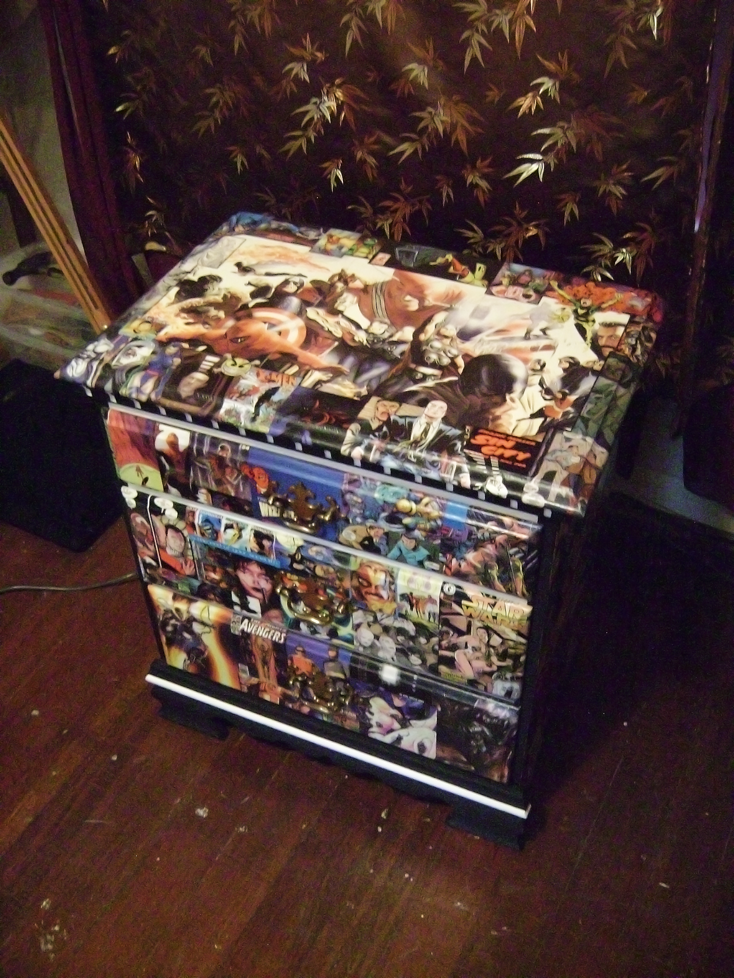
This table started its life as a cheap, three-drawer nightstand my grandma had lying around her house. When I complained about not having a nightstand in my room at my parents' house several years ago, she gave it to me. After moving out, I had a bit more room to stretch out and the nightstand became a storage unit for my art supplies, but it wasn't very ... inspiring. Conveniently, I had a bunch of old comic book magazines lying around, just waiting to be thrown away. Instead, I broke out the scissors and starting weeding through the pages for favorites from the past...


I started by painting over the boring wood on the front with some black and white paint. It matched the theme I was going with a little better. Then I used some of the smaller images on the drawers. I took the handles off before the collaging and just punched them through the paper when they were dry.


For the sides, I used some bigger images (like covers and full/half page pictures) to cover more ground. I separated them a bit with some black outlines to sort of give each image its own "space".


I took a bit of a different approach to the top. I found one cover that I really liked (a three-panel fold out cover painted by Alex Ross) and made that the center piece. I framed it with some smaller images, and drew a black border around the outside edge of the "frame" to keep things separated.

And there you have it! The finished product! It feels pretty good to be able to mark at least that off my to-do list, not to mention it's fun to look at. Next on the list ... some cross stitching!

Until then, enjoy! And remember, finishing stuff is good and good for you!


Tuesday, July 28, 2009

disEnchanted: The Process

Week eight! Who would have thought I'd make it this far into a weekly comic without missing a single deadline? Okay, so it's really not that big of a deal, but I'm pretty proud of myself. So, in honor of two whole months without missing a beat ... something special! I've been meaning to do a "how it's done" blog about my webcomic, disEnchanted, for a while now. Nothing fancy really, just a little sneak peek inside the mouth of madness. And now, without any further ado: A step-by-step voyage through the process of my fantastically fantastical (and often snarky) comic!


STEP 1: The Sketch

The first thing I do is lay out the panels. I divide an 8.5 x 11 field into three semi-equal parts, draw a quarter-inch border around the outside and then in between the three fledgling panels. By this point, I generally have an idea how the story and dialog are going to flow, so I break up the panels accordingly. In this case, three panels have become five! Once the panels are all laid out, I start sketching, first the simple shapes of where the characters will be in each panel. From there I tighten up the loose sketches until I have a pretty close rendition of what the outline is going to look like. It's still pretty messy, though, so I...

...go in with a black pen and finalize the sketch. This is kind of an extra step I do just to make it easier to do the final outline. I like to sketch with pens, usually red ones, and I make a lot of crazy lines (who doesn't?). This step lets me pick out the lines I want to keep and make them more defined so they don't get lost in all of the muck. Nobody likes getting lost in the muck, after all... Before, I've sketched up to this point on paper and then scanned in the initial drawing, but this time around I tried something a little different. For this comic, I opened an 8.5 x 11 document in Photoshop and did the sketching with my tablet on two separate layers. I'm pretty pleased with the result! I may not have the sketches to put in my sketchbook or hang on the wall, but I also don't have to deal with scanning the image, making sure it's straight, etc. Also, I kind of like sketching with my tablet. It's fun! Anyway, on to...


STEP 2: The Final Countdown
... I mean ... Outline
After the sketch is all done, I place the file in Illustrator and turn the opacity down so I have a better idea of what I'm drawing now, as opposed to what is already there. It's easier for me to draw all of the straight lines and flat surfaces (like computer monitors, counters, refrigerators, etc.) in Illustrator, and I can also choose whatever brush I want after all of the lines are drawn. In most cases, I use a thin charcoal brush for these lines because it helps them blend into the background a little better than a totally smooth line would. When this is done, I select all and copy it for the journey back to Photoshop!

This is where the real fun starts! I keep the opacity of the sketch layer at about 50%, paste in the outlines I did in Illustrator, and warm up the ol' tablet for some character outlines! I use a brush with kind of a softer edge and control the size with the pen pressure for a more dynamic effect. In this stage, I make any last minute tweaks to the sketched version that I feel are necessary. This is, after all, the Final Outline! Once this is all done, it's time to move on to...


STEP 3: Color
The coloring stage is where I do
things a little differently. Instead of picking out a brush and just painting in everything, I've made and scanned several watercolor swatches that I use to fill in color. It gives the comic a unique texture, and it's just ... well ... different!

First, with the sketch layer still visible, I block in the backgrounds of the panels. This is just to ensure that my panels stay close to the outlines I had measured out for them. Notice that the panels aren't perfectly squared ... that's just part of the natural look that using the watercolor swatches gives. Also, I don't worry about the corners being perfect because most of them end up getting covered by other swatches when I color the foreground. After the background is all laid down and resized, I hide the sketch layer (for now) and start filling things in with more colored swatches!

Here is an example of what I do. I choose whatever it is I want to color (in this case, the boy's skin) and choose a colored swatch for that area. If I don't have one that's exactly what I want, I adjust the hue, saturation, and color balance until I come up with what I need. If it's a recurring color, I may save the swatch for use later. Anyway ... once I get the color I'm looking for, I paste the swatch in between the outline and the background, cut it up, and move it to the places that color appears. When I have all of the areas covered, I trace around the areas with the lasso tool, select the inverse, and delete the overflow areas!

Here's an example with some other colors laid down. Slowly but surely, the pieces fall into place... Like I said, this may not be the easiest method of coloring a comic, but I like it!

Here we have the almost finished product. All of the color swatches have been laid down, cut out, and the layers reordered if necessary. It looks good, but a little ... flat. Time to break out the tablet again!

To shade and highlight, I just pick a color that's quite a bit darker (or lighter) than whatever it is I'm working with and paint at 20% opacity in a new layer between the swatches and the outline. This is subtle enough to allow the texture of the watercolor to show through, yet still solid enough to be visible. If I feel some areas need to be a little darker or lighter, I just go over them again with the same brush. For the barista's hair and clothing, I select areas with the polygonal lasso tool and change the brightness and contrast. This is what it looks like, completely colored, before the text goes on in...


STEP 4: Text and Finishing
The first thing I do is bring back the sketch layer. There, I've laid out the basic placement of the speech bubbles and banners (if there are any). In Illustrator, I have a few pre-made bubble/banner outlines, so I open those files up in preparation. I pick out one of the basic outlines, copy it, and paste it where it fits best, often resizing them to get an idea of how much space I'm working with for the actual text. I repeat this step until I have them basically where I want them.


And for my next trick ... text! I polish up the dialog and make sure it fits into the bubbles. I might still have to do a little resizing and redrawing of the actual bubbles so it does fit all nice and snug, but nobody's perfect, eh? At this point I could just delete the sketch layer if I wanted, but I just hide it again. I might be a bit of a packrat when it comes to drawings. You never can tell if you might need something again, and as soon as you throw it away ... you end up needing it. That's how it always works out for me, anyway...

Now, the finishing touches! I make a new paint layer under the text and bubble outlines, select inside and behind the outlines, and color those bubbles in! I pull the title out of my Illustrator file and add it in the corner, as well as the url and signature at the bottom. I add a little bit of a drop shadow to the speech bubbles and the title to help them stand out a little better and ... ta-da! Finished comic! I compress the file down to a PNG, resize it, and post it on it's temporary home page here, and on it's very own deviantArt page here (along with a few little extras from time to time).

And that is how it's done! Thanks for sticking with me on this crazy, rambling journey through the creative (and sometimes painstaking) process of disEnchanted! As always, I'm very open to comments, suggestions, constructive criticisms, and kittens. Feel free to contact me at godfrey.ad@gmail.com with any of the following!

Just ... don't try sending any REAL kittens via e-mail.

I don't think that could possibly end well...

Oh, and thanks again!