STEP 1: The Sketch
 The first thing I do is lay out the panels. I divide an 8.5 x 11 field into three semi-equal parts, draw a quarter-inch border around the outside and then in between the three fledgling panels. By this point, I generally have an idea how the story and dialog are going to flow, so I break up the panels accordingly. In this case, three panels have become five! Once the panels are all laid out, I start sketching, first the simple shapes of where the characters will be in each panel. From there I tighten up the loose sketches until I have a pretty close rendition of what the outline is going to look like. It's still pretty messy, though, so I...
 ...go in with a black pen and finalize the sketch. This is kind of an extra step I do just to make it easier to do the final outline. I like to sketch with pens, usually red ones, and I make a lot of crazy lines (who doesn't?). This step lets me pick out the lines I want to keep and make them more defined so they don't get lost in all of the muck. Nobody likes getting lost in the muck, after all... Before, I've sketched up to this point on paper and then scanned in the initial drawing, but this time around I tried something a little different. For this comic, I opened an 8.5 x 11 document in Photoshop and did the sketching with my tablet on two separate layers. I'm pretty pleased with the result! I may not have the sketches to put in my sketchbook or hang on the wall, but I also don't have to deal with scanning the image, making sure it's straight, etc. Also, I kind of like sketching with my tablet. It's fun! Anyway, on to...
STEP 2: The Final Countdown ... I mean ... Outline
 After the sketch is all done, I place the file in Illustrator and turn the opacity down so I have a better idea of what I'm drawing now, as opposed to what is already there. It's easier for me to draw all of the straight lines and flat surfaces (like computer monitors, counters, refrigerators, etc.) in Illustrator, and I can also choose whatever brush I want after all of the lines are drawn. In most cases, I use a thin charcoal brush for these lines because it helps them blend into the background a little better than a totally smooth line would. When this is done, I select all and copy it for the journey back to Photoshop!
 This is where the real fun starts! I keep the opacity of the sketch layer at about 50%, paste in the outlines I did in Illustrator, and warm up the ol' tablet for some character outlines! I use a brush with kind of a softer edge and control the size with the pen pressure for a more dynamic effect. In this stage, I make any last minute tweaks to the sketched version that I feel are necessary. This is, after all, the Final Outline! Once this is all done, it's time to move on to...
STEP 3: Color
The coloring stage is where I do things a little differently. Instead of picking out a brush and just painting in everything, I've made and scanned several watercolor swatches that I use to fill in color. It gives the comic a unique texture, and it's just ... well ... different!
 First, with the sketch layer still visible, I block in the backgrounds of the panels. This is just to ensure that my panels stay close to the outlines I had measured out for them. Notice that the panels aren't perfectly squared ... that's just part of the natural look that using the watercolor swatches gives. Also, I don't worry about the corners being perfect because most of them end up getting covered by other swatches when I color the foreground. After the background is all laid down and resized, I hide the sketch layer (for now) and start filling things in with more colored swatches!
 Here is an example of what I do. I choose whatever it is I want to color (in this case, the boy's skin) and choose a colored swatch for that area. If I don't have one that's exactly what I want, I adjust the hue, saturation, and color balance until I come up with what I need. If it's a recurring color, I may save the swatch for use later. Anyway ... once I get the color I'm looking for, I paste the swatch in between the outline and the background, cut it up, and move it to the places that color appears. When I have all of the areas covered, I trace around the areas with the lasso tool, select the inverse, and delete the overflow areas!
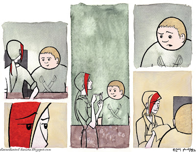 Here's an example with some other colors laid down. Slowly but surely, the pieces fall into place... Like I said, this may not be the easiest method of coloring a comic, but I like it!
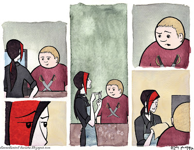 Here we have the almost finished product. All of the color swatches have been laid down, cut out, and the layers reordered if necessary. It looks good, but a little ... flat. Time to break out the tablet again!
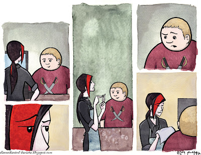 To shade and highlight, I just pick a color that's quite a bit darker (or lighter) than whatever it is I'm working with and paint at 20% opacity in a new layer between the swatches and the outline. This is subtle enough to allow the texture of the watercolor to show through, yet still solid enough to be visible. If I feel some areas need to be a little darker or lighter, I just go over them again with the same brush. For the barista's hair and clothing, I select areas with the polygonal lasso tool and change the brightness and contrast. This is what it looks like, completely colored, before the text goes on in...
STEP 4: Text and Finishing
 The first thing I do is bring back the sketch layer. There, I've laid out the basic placement of the speech bubbles and banners (if there are any). In Illustrator, I have a few pre-made bubble/banner outlines, so I open those files up in preparation. I pick out one of the basic outlines, copy it, and paste it where it fits best, often resizing them to get an idea of how much space I'm working with for the actual text. I repeat this step until I have them basically where I want them.
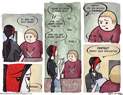 And for my next trick ... text! I polish up the dialog and make sure it fits into the bubbles. I might still have to do a little resizing and redrawing of the actual bubbles so it does fit all nice and snug, but nobody's perfect, eh? At this point I could just delete the sketch layer if I wanted, but I just hide it again. I might be a bit of a packrat when it comes to drawings. You never can tell if you might need something again, and as soon as you throw it away ... you end up needing it. That's how it always works out for me, anyway...
Now, the finishing touches! I make a new paint layer under the text and bubble outlines, select inside and behind the outlines, and color those bubbles in! I pull the title out of my Illustrator file and add it in the corner, as well as the url and signature at the bottom. I add a little bit of a drop shadow to the speech bubbles and the title to help them stand out a little better and ... ta-da! Finished comic!
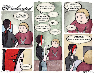 I compress the file down to a PNG, resize it, and post it on it's temporary home page here, and on it's very own deviantArt page here (along with a few little extras from time to time).
And that is how it's done! Thanks for sticking with me on this crazy, rambling journey through the creative (and sometimes painstaking) process of disEnchanted! As always, I'm very open to comments, suggestions, constructive criticisms, and kittens. Feel free to contact me at godfrey.ad@gmail.com with any of the following!
Just ... don't try sending any REAL kittens via e-mail.
I don't think that could possibly end well...
Oh, and thanks again!

No comments:
Post a Comment